Connecting companies with real users through smarter research.
📍 WebApp (desktop) for companies | Mobile App for users.

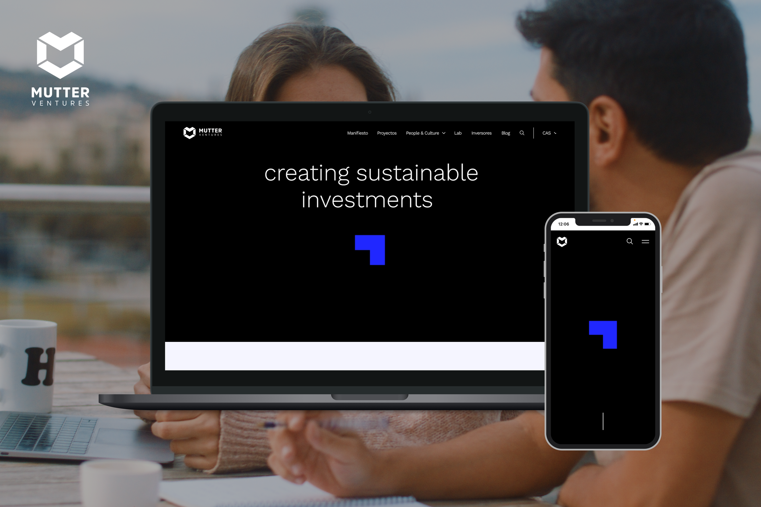
Criterius
User Research / UX Rearch / Insight Platforms
ROLE
TYPE - PLATFORM
UX/UI Designer
B2C/B2B - Website / Web app / App
TIMELINE
2023
SECTOR
COMPANY
OVERVIEW
Criterius is a research platform designed from scratch to help companies streamline how they connect with real users. It enables them to launch campaigns, schedule interviews, and gather valuable insights directly from their target audiences, all in one place.
This wasn’t just a responsive website or an app; it was two distinct products with very different users and needs. On one side, companies looking to validate ideas and test products. On the other, people open to participating in studies and earning for sharing their feedback.
CHALLENGE
We wanted to build a research ecosystem that felt simple and intuitive, even though the workflows were complex.
Both ends of the platform needed to feel seamless, not only visually, but also in how tasks like scheduling, payments, or campaign management were handled.
RESEARCH & DISCOVERY
To kick off, we interviewed teams from startups and small agencies to understand how they currently source user feedback. We also talked with people who participate in studies to learn about pain points (spoiler: most platforms are clunky and unclear about payments).
This helped us define two core user personas:
🥷🏽 “The Researcher”: A product manager or designer who wants to move fast and doesn’t have time for friction.
😎 “The Participant”: A curious, time-conscious user who values transparency and flexibility.
STRATEGY
With our research in hand, we defined a clear roadmap:
Prioritize usability and ease of navigation.
Create fully separated but connected experiences for companies and users.
Make scheduling and payment tracking effortless.
Build trust with a polished, professional visual language.
🖥️ For Companies (Desktop WebApp)
We designed a complete dashboard for companies to manage every part of the research process.
🧠 Key features:
Campaign builder: Create campaigns, define user profiles, and launch in minutes.
Calendar view: See upcoming interviews at a glance.
Payment history: Track budgets and spending by campaign.
Campaign insights: Monitor who joined, no-shows, and participant feedback.
Profile management: Edit team details and access permissions.
Everything was optimized for clarity, speed, and flexibility — especially for users running multiple campaigns at once.
📱 For Participants (Mobile App)
Participants needed a lightweight, frictionless app experience that made them feel in control.
🔮 Key features:
Personalized dashboard: View upcoming studies and potential earnings.
Campaign detail pages: Clear info on what the study is about, the reward, and how to join.
One-tap sign-ups: Join or leave campaigns easily.
Payments tracker: See how much you’ve earned and when to expect transfers.
We kept things transparent and friendly, using clear copy and minimal flows to avoid overwhelm.
DESIGN APPROACH
We created wireframes and flows for both platforms in parallel, using a modular design system to maintain consistency.
Then, we moved into high-fidelity visual design, keeping things clean, professional, and focused on usability.
We used a soft color palette and plenty of white space to make both interfaces feel breathable and trustworthy. Typography and iconography were carefully chosen by our graphic designer to support clarity without overcomplicating the experience.
TESTING & HANDOFF
We tested both apps with real users (and real companies!), refining flows like campaign setup and interview scheduling based on their feedback.
The final UI was handed off to development with detailed specs and states for all key components.
FINAL THOUGHTS
Criterius was one of those rare projects where I got to shape the product from zero, from research to UX flows to final UI.
Balancing the needs of two very different users was a challenge, but also what made it exciting. In the end, we delivered a tool that’s functional, professional and easy to love.
For Companies - Desktop Web App

Interviews calendar.

New campaign - Step 1.

New campaign - Step 2.

Campaign details.


New campaign - Step 3.
Payment history.

New campaign - Step 4.
For Participants - Mobile App


Average campaign detail.
Special campaign detail.


Campaign detail, CTA unsuscribe.
Time availability.


Profile.
Payments.


Dashboard.
Profile.


Dashboard with open sidebar.
Dashboard.
More projects
Curious about what else I’ve been working on?
Browse through more projetcs and discover how I approach design across different challenges and industries.