Helping professionals navigate reskilling and upskilling with clarity and confidence.

UpGrowz
EdTech / Career Development / Lifelong Learning
ROLE
TYPE - PLATFORM
UX/UI Designer
B2B/B2C - Website
TIMELINE
2021
SECTOR
COMPANY
OVERVIEW
While completing my final project at Ironhack, I had the opportunity to work directly with UpGrowz, a startup focused on helping people reskill or upskill effectively.
What started as a capstone turned into a real collaboration, after the program, they reached out to continue working together on their MVP.
CHALLENGE
In a world where job markets evolve faster than ever, finding the right course can feel overwhelming.
UpGrowz wanted to simplify this, by creating a comparator platform that empowers users to discover, compare, and choose educational paths based on their unique goals and preferences.
🌟 Our north star?
Build a solution that makes complex decisions feel simple, human, and actionable.
MY ROLE
🧠 Led user research and stakeholder workshops to align product goals with user needs.
💡 Translated research insights into actionable UX strategies and product priorities.
🎨 Designed wireframes, interactive prototypes, and conducted usability testing for the MVP.
DISCOVERY & RESEARCH
Before jumping into wireframes or features, we needed to understand the people we were designing for. I led a series of user interviews, surveys, and stakeholder alignment sessions to uncover:
What are people struggling with when choosing courses?
What motivates someone to reskill or upskill?
What would make them trust a comparator tool?
We mapped these insights into personas, like Marta, a marketing professional looking to break into UX design, and Alex, a logistics manager needing a flexible program to transition into tech.
DEFINING THE EXPERIENCE
From our research, we identified key features users needed most:
🥷🏽 For users:
Smart Search: A clean, intuitive search bar to find courses quickly.
Dynamic Filters: Course type, price, duration, level, location, and format.
Side-by-Side Comparisons: Course content, learning outcomes, price, certifications — all in one view.
User Reviews & Ratings: Real feedback to guide decisions.
Course Alerts: Notifications for new relevant programs.
We also gathered data points that users wanted to see at a glance: accreditation, job placement rates, payment plans, and peer opinions.
WIREFRAMING & PROTOTYPING
Once we defined the architecture, we moved into low-fidelity wireframes to map the user flows, from first search to course sign-up. We iterated rapidly based on team feedback, ensuring we balanced simplicity with robustness.
When ready, we translated these into interactive high-fidelity prototypes using Figma.
The UI followed a clean, modern aesthetic, designed to feel trustworthy, empowering, and approachable.
USABILITY TESTING
We tested early with potential users and got clear signals on what worked, and what didn’t.
“I love that I can compare things side by side. It feels like I’m making a smarter decision.”
“Can I save the courses to review later?” (Feature added ✅)
These sessions helped us streamline the navigation, improve content hierarchy, and simplify the language used throughout.
OUTCOME
UpGrowz walked away with a solid MVP prototype ready for development, one grounded in user insights and tested interaction patterns.
The experience led to a continued collaboration where I supported their product team post-launch.
This project reminded me how empowering good UX can be, especially when it helps people make big life decisions with clarity and confidence.
🔗 Want to see more?
Let’s talk — or visit upgrowz.com

Personal recommendations.

Added courses.

Compare courses list.
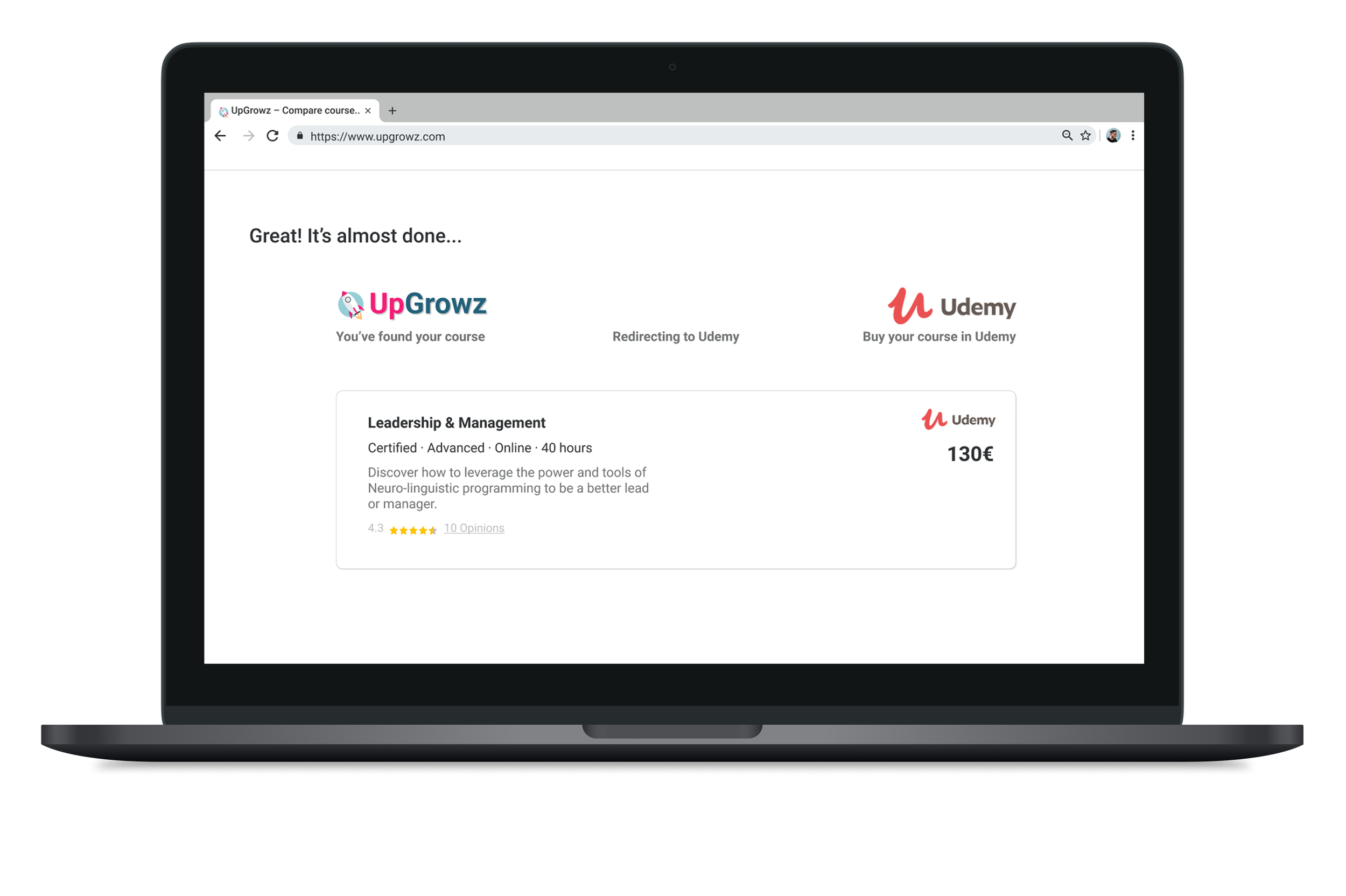
Redirecting to Udemy website.


Homepage.
Soft skills selection.

Interest selection.

Hard skills selection.
More projects
Curious about what else I’ve been working on?
Browse through more projetcs and discover how I approach design across different challenges and industries.